Tag: art
Bunnies, rabbit ears, overwhelming subtext.

I guess that is photoshopped? I started looking at blogs in languages I don’t understand, and ended up finding a whole bunch of bunny-related images. There is nothing to understand.


Art, deer, non-modified just retro.

This looks violent.
A desktop image about attachment.

More modified art, counterfeit Jesus, web zen.

This sounds like fado, and I want to add halos to every bearded image.
Alien menstruation, casual toilet time.

I notice I am posting things here that ordinarily I would post at All About My Vagina, because I am not happy with the design over there.
Art hacks, silhouettes, checkers death match.

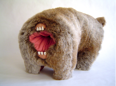
Monsters on thrift store art.

Thinking about enhancing thrifted plates reminded me of the vintage vandals shows from 2005.
Blue Rose, campy modified plate set

About a thousand dollars for the set of six. More importantly, this gives me all kinds of ideas for things to do with thrift store plates.
Beards & stripes

Apparently these will be for sale on Etsy. I’m filing this under “knitting” because the stripes are giving me a yarn urge.
Ernst Haeckel, categorization, sets of sets, primary colours, dog tv

I fell into a bit of a well of naturalism and anatomy links, and ended up wanting to read Stuffed Animals and Pickled Heads: The Culture and Evolution of Natural History Museums, although I’m pretty sure it isn’t as critical or curious as I want it to be. One review quotes this tedious oversimplification as a “philosophical insight into the scientific and human impulse to categorize.”
“To have a concept… is to have its negation already in tow…. There is a class of things called ‘dog,’ and there is a class of things (quite substantial, in fact) that are ‘not-dog.’… Language and thought cannot really function without this most basic tool for carving up reality.”
Never heard of fuzzy continuums and the rewards of using them, I guess? Odd, since natural history museums are full of ambiguous specimens (two headed mutant dog, alleged dog-cow hybrid, newly discovered tentative dog, etc) that illustrate quite nicely the space between dog and not-dog. Sort of dog. Possible dog. Both dog and yet not dog. Natural history museums are pretty much ground zero for failed categorization schemes and fuzzy margins, sets that are more complicated than somebody was hoping they would be. Maybe the quote is just out of context. There are a lot of ellipses in there.
To balance out the sad saga of binary categories in science, I like to think about primary colours. These seem like a life-affirming, pro-ambiguity, scientific success. Primary colours are sets of colours that are chosen to maximize the usefulness of the spectrum between them. A noble, everybody-wins way to think about categorization, and also an easily visualized example of information organized into multiple overlapping continua. Wikipedia points out that “Any choice of primary colors is essentially arbitrary; for example, an early color photographic process, autochrome, typically used orange, green, and violet primaries.” Concrete! Maybe this is because colour science is so bluntly tied up in perception and perspective. It has to be aware of observer bias and intention, because it is about observing. My favourite bit of that Wikipedia page:
If a human and an animal both look at a natural color, they see it as natural; however, if both look at a color reproduced via primary colors, for example on a color television screen, the human may see it as matching the natural color, while the animal does not; in this sense, reproduction of color via primaries must be “tuned” to the color vision system of the observer.
I wonder how long it will be before someone makes a TV for dogs, with two kinds of pixels instead of RGB. Or TV for bees, with four kinds.
7 wrens, sets of sets

I was thinking about sets of sets when I came across this set of similar wrens, discussing the collections of identifying marks that make up a distinguishable bird species.
The same site has a lovely little discussion of preparing the mind to see birds.
Experts say that when we lose something, before we begin our search to find the lost thing we should picture the object in our minds. This kind of “visualization” causes the brain to do something wonderful. On the one hand, it appears to filter out many unnecessary sightings but, on the other, if something even remotely resembling the lost object comes into view, the mind seems to “jump” at it.
Power of pattern matching.
Sets of sets, letters with warping

Repetition with variation along two dimensions: different Rs, warped to different degrees.
Alphabetized Bible, censorship, wordplay, absurdity


Memento mori, Edward Gorey


I had never thought of the Gashleycrumb Tinies as a memento mori, just a funny bit of kids’ horror, until somebody posted them all under the heading Ars Moriendi.
Monster love, my favourite.

a skinny older man body

When I saw the Century Project (a man took nude photos of women from ages 0-100), my first thought was to wonder whether anybody was making a similar collection of naked men. I think there is more of a lack of images of naked men overall. So I collected this one a few months ago, and that’s as far as I got.
Huge knitted sash, clothes with tassels

This is a couple of years old, but it is still my favourite thing at Steal This Sweater. It doesn’t even make sense as clothes, only as decoration.
Greens, facial expression, halves

“olive says: there’s too much heed paid to the law of thirds.”
Scars, stories
Photograph a scar and write about it is still one of my favourite assignments from Learning to Love You More.
“The life of art”
I’m reading a book on the history of horror movies (finally, prompted by a haunted house analysis that Dark Daughta linked). My horror book quotes a character from Upton Sinclair’s 1922 novel They Call Me Carpenter, talking about The Cabinet of Dr. Caligari.
This picture could not possibly have been produced in America. For one thing, nearly all the characters are thin. … One does not find American screen actors in that condition. Do your people care enough about the life of art to take a risk of starving for it?
Marian Bantjes’ first font
Restraint is a font by Marian Bantjes, something I have wished for many times! So many obsessive, interlocking ornaments that it comes with instructions. (Restraint. Ha ha.)
Rug center, zig zags

I’ve had this bookmarked for months. I really like to look at it.
Machine of Death

Machine of Death is an upcoming published anthology of short stories edited by Ryan North, Matthew Bennardo, and David Malki !, inspired by this episode of Ryan’s Dinosaur Comics.
All the stories will be about a world where a machine can tell people how they will die.
The machine had been invented a few years ago: a machine that could tell, from just a sample of your blood, how you were going to die. It didn’t give you the date and it didn’t give you specifics. It just spat out a sliver of paper upon which were printed, in careful block letters, the words “DROWNED” or “CANCER” or “OLD AGE” or “CHOKED ON A HANDFUL OF POPCORN”.
At a recent art opening, I pulled exactly such a slip of paper from an art installation by Hank Pine, and the mix of deadly predictions was very similar. A good variety of glamorous or outlandish ways to die (decapitation, dusting accident, lead pipe…), with the occasional realistic downer (I myself got “leukemia”).
Small talk around the death oracle was exactly as described in that call for submissions. “It said ‘lead pipe’… but I don’t know if I’ll be hit with a pipe or poisoned by lead plumbing.”
“OLD AGE”, it had already turned out, could mean either dying of natural causes, or shot by a bedridden man in a botched home invasion. The machine captured that old-world sense of irony in death— you can know how it’s going to happen, but you’ll still be surprised when it does.
I think part of the reason the diseases managed to be shocking was that there were fewer loopholes. “Hey, I… I can’t think of an ironic way to die of AIDS.”
A death oracle might be a good format for my long standing intention to find out, statistically, how I’m likely to die. Filling a hat with 45% “heart attack” would be several levels more morbid, somehow. Not as personalized as the Machine of Death, but just as accurate, in its way. A Pie Chart of Death is within the reach of current technology.
Guy Maddin is my muse of the week
Interview with Guy Maddin, one of my favourite directors, from October 2006:
GM: I’m also kind of pleased with what I came up with. It was such short notice that I didn’t have time to make anything up, I had to just be very honest. So much so that I can’t really show it to my family. I’d be disinherited, things like that.
TB: It’s kind of funny to hear you say that about a film that involves organ harvesting in a lighthouse.
GM: Yeah, I sort of promised myself I’d never talk about that part of growing up. It’s all there now! But sometimes you can hide things in plain sight.
I watched The Saddest Music in the World three times over the weekend, with and without commentary, and now I find myself hanging on every word out of Guy Maddin’s mouth.
His comments about expressionism in the Saddest Music are helping me with my mission to draw. He did things like shoot the actors making assorted facial expressions against a black backdrop so he could stick them in whenever he needed a shot, figuring that nobody really cares whether the backgrounds are consistent or accurate: the characters are in the movie, that’s enough context. I like that specific tactic, to just stick everything in together and nevermind the accuracy. It’s helping me draw, and design websites. I’m good at thinking up parts; less good at accurately proportioning them.
This other comment is helping me think about giant projects that involve a lot of research:
I know the Japanese had a different way of presenting silent film altogether, with a benshi narrator who would get in to characters or supply their own narratives that ran athwart the text unfolding on screen and that sounds really elaborate. The most I wanted my interlocutor to do was sort of season up, spice up, the proceedings a little bit and, truthfully, clarify some spots where I may not have shot things clearly enough. The benshi thing I found out about just a bit too late to figure out how to work with it and incorporate it myself.
That happens to me a lot, getting into a project and then finding really inspirational ideas right at the end. I have to insist that it’s ok, a good sign even, to be spotting neat ideas all the way through a project instead of having a complete and perfect idea right from the beginning.
And of course I’m looking forward to sometime seeing the organ harvesting movie, The Brand Upon The Brain.