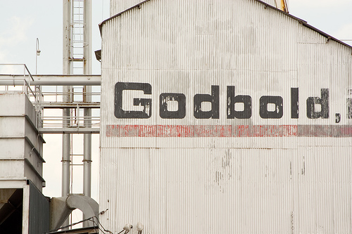
‘John Gambell suggests the typefaces we as a society choose in which to set our messages are meant to stand in for the speaker of the words themselves’. I do think God would be represented as speaking in bold, generally. I’d be curious to see what would happen with something like Godhandscript Extra Light Distressed. Casual whispering God.
One thought on ““this should be a typeface, called Godbold””
Comments are closed.

Hey Sarah. The Godbold Typaface post is hilarious, what an idea 🙂 If God (the Christian God, by all means) was a blogger, I guess this is just the typeface he’d use, all bold and big and eckig and square-ish. Yep.
Anyway, I’m writing to let you know about how much I love your site. I found a link to’t a few days ago on Darkdaughta’s blog (which I found a few weeks ago in Reloaded on your All About My Vagina – which BTW is a page deeply loved, appretiated and (in the past, when I was an information-lacking, in a body-negative and taboo-ist enviroment living young girl) often used by me, and I am so very thankful for all the things it provided to me) and it rocks and I visit it mostly daily and I love love love it.
Umm, that’s quite an odd long sentence.. Nevermind, I guess I just wanted to write THANK YOU for what you do.
Thank you for what you do, Sarah.