
Tag: colours
Plant dyes, having a smell, odourlessness in general.
Lump indigo (blue)
Old recipe from Outer HebridesBoil wool with onion skins till clear yellow, then let wool dry. Have an old pail filled with urine at least two weeks old, or until skin forms on top… Put lump indigo in a muslin bag, heat the “bree” by placing a hot stone in it. Squeeze in the blue bag. Wet the wool and place in the liquid. Cover the vessel and place where it will keep warm… For navy blue, 11 to 21 days are required. Fix with boiled sorrel roots as rinsing water.
— Dye Plants and Dyeing, Brooklyn Botanic Garden Record, 1964.
Books about natural dyeing have a lot of lore I hadn’t foreseen. So many smells! Boiling weird fungi, soaking fiber with onions (“It will take at least four washings to eliminate the odour”), fermenting urine. One book detailed an argument between the author and her editor about whether traditional Harris tweed, dyed with lichens, smelled “musty” or, less judgmentally, “earthy.” I had no idea that tweed used to have a smell. I am fascinated by this, and want to dye all my clothes with different plants to get to know the smells.
Why don’t I expect my clean clothes to have a smell? Not a laundry scent, but a part of their nature. I can remember talking about the smell of my clothes like a normal thing, all the time. Wool sweaters smell sheepy if I get wet in the rain. A couple of weeks ago I told someone (who?) that I liked the smell of raw silk, because I was knitting with a silk blend yarn. I can recall the scent of cotton in my mind’s nose: wet, dry, or hot. Why did I still think of clothes as odourless?
Heather wrote once (or maybe we spoke) about why people are so obsessed with genital odours. Do they smell right? Do they smell too strong? How to keep the smells in control? She suggested that this was partly because we have come to expect the entire rest of our bodies to have no odours at all. Healthy hair, feet, armpits, mouths, and skin in general all have smells, too, but between washing and deodorizing they’ve been redefined as ideally odourless. It’s total fantasy, bodies still smell, but we expect odourlessness. (Like my clothes!) Compared to that, genitals are almost getting smellier by contrast.
Thinking about the more familiar politics of body odours makes me even more interested in knowing what smells are required to make the colours in my clothes. These plant dyes seem like an opportunity to make experiential connections, to know things by observation. To have know what clothes smell like and why, instead of not knowing what shocking petrochemical smells are happening at distant textile factories. It feels grounding. Educating my mind’s nose. I have some pondering to do, regarding wood smoke and other smells that have been banished from modern, civilized, classy life.
I think I will start slow, though, with tea and lavender dyes. Fermenting a bucket of my own urine is going on the “someday I will peek behind this curtain” list along with attending a pig or goat slaughter. Someday.
Hug industries.

Typos create alternate realities. From the promo copy for Mauve: how one man invented a colour that changed the world, in the local library’s online catalog. Surreal book titles create alternate realities, too.
Crafting with selvedges.

Apparently I respond to the crop marks and assorted colour spots of any kind of printing.
Mystical netherpools.


Repetition with variation. Magic.

I know that in typography “dazzling” is a technical term where your eyes get confused by large areas of small, intense contrasts. Maybe quilting has that too.
Blue and green, RGB dress, making do with close-ups

Those blue and green colours give me physical pleasure the same way red and blue do. There are other colour schemes that I get excited about, but I have a soft spot for red-green-blue because of working at a monitor all day.
All this to say that I made an RGB outfit and wearing it is my own spiritual rapture. The colours of personal happiness. On my body. I may or may not succeed in documenting it with a full length photo, but I have collected these fragments.
The bottom of the dress (I’m the fishnets).

The top of the dress (under a cardigan, and I should mention that I shrunk one eye in photoshop because my camera has a bit of a fishbowl effect around the edges and sometimes it catches faces in distracting ways).

I made a sash out of lime green dupioni silk (shiny).
And then with this scarf, it makes the holy trinity of colour pixels.

I’m working on expressing more political intentions with my wardrobe (slowly… I am mostly making things not buying them), but for now I am glad to express any conscious intention.
Edges, white on white on white

I don’t want to just start posting other people’s photos with no discussion, but on the other hand I don’t want to save this image forever as a draft. Posting it now, writing another day.
Also, butter is delicious.

Gelato, fruit, before and after, more neglected colours

Fake nails, colours I neglect

Egg design, humidity, white on white on white.

A humidifier, apparently.
Beards & stripes

Apparently these will be for sale on Etsy. I’m filing this under “knitting” because the stripes are giving me a yarn urge.
Ernst Haeckel, categorization, sets of sets, primary colours, dog tv

I fell into a bit of a well of naturalism and anatomy links, and ended up wanting to read Stuffed Animals and Pickled Heads: The Culture and Evolution of Natural History Museums, although I’m pretty sure it isn’t as critical or curious as I want it to be. One review quotes this tedious oversimplification as a “philosophical insight into the scientific and human impulse to categorize.”
“To have a concept… is to have its negation already in tow…. There is a class of things called ‘dog,’ and there is a class of things (quite substantial, in fact) that are ‘not-dog.’… Language and thought cannot really function without this most basic tool for carving up reality.”
Never heard of fuzzy continuums and the rewards of using them, I guess? Odd, since natural history museums are full of ambiguous specimens (two headed mutant dog, alleged dog-cow hybrid, newly discovered tentative dog, etc) that illustrate quite nicely the space between dog and not-dog. Sort of dog. Possible dog. Both dog and yet not dog. Natural history museums are pretty much ground zero for failed categorization schemes and fuzzy margins, sets that are more complicated than somebody was hoping they would be. Maybe the quote is just out of context. There are a lot of ellipses in there.
To balance out the sad saga of binary categories in science, I like to think about primary colours. These seem like a life-affirming, pro-ambiguity, scientific success. Primary colours are sets of colours that are chosen to maximize the usefulness of the spectrum between them. A noble, everybody-wins way to think about categorization, and also an easily visualized example of information organized into multiple overlapping continua. Wikipedia points out that “Any choice of primary colors is essentially arbitrary; for example, an early color photographic process, autochrome, typically used orange, green, and violet primaries.” Concrete! Maybe this is because colour science is so bluntly tied up in perception and perspective. It has to be aware of observer bias and intention, because it is about observing. My favourite bit of that Wikipedia page:
If a human and an animal both look at a natural color, they see it as natural; however, if both look at a color reproduced via primary colors, for example on a color television screen, the human may see it as matching the natural color, while the animal does not; in this sense, reproduction of color via primaries must be “tuned” to the color vision system of the observer.
I wonder how long it will be before someone makes a TV for dogs, with two kinds of pixels instead of RGB. Or TV for bees, with four kinds.
Good looking light pattern

Stripes and stripes and squares.

Excessive red and blue in my kitchen, being impressive, calendar trivia…

For a moment I was feeling disappointed that I hadn’t come up with any simple theme for the photos I’ve been posting this week. (I don’t know if anyone even noticed them, but the matching sets of red and blue and crafty ideas and so on were making me more comfortable.) I got to thinking about the ways I use gimmicks like that whenever I make things, as a way to add automatic value to whatever I produce. Obvious extra effort. If nothing else, the project will look like a lot of work, which is impressive in certain ways, by default. I’m trying to stop doing that automatically and cut to the chase more. Be more honest instead of more impressive. Probably every adult thinks about this at least a little bit, in some context. I thought I was doing alright with this personal growth project, but then at a festive feast with my extended family, a cousin’s friend commented that I seemed well read. That’s probably my number one trying-to-impress-you habit, being smart. It’s complicated, because I do like to learn things and I do like to share what I find out and not hoard it, but if I want to be your friend I will almost surely start telling you a lot of fanciful trivia related by a larger theme instead of, for example, asking you to tell me about things you seem to know that I don’t. Reading about DIY education is helping me work on this. It makes nonconsensual teaching really, really embarrassing.
So. As my early morning mind-map hopefully explains, I was all set to embrace the non-patterned nature of my really low-effort holiday posts. Then I got to thinking about how much I love the way the last week of the calendar year can get divorced from daily reality and kind of out of time. Students and lots of workers are on holiday from their regular schedules, you never know when shops are going to be open, many households have visitors or go visiting, a lot of people eat really strangely… Regular patterns don’t hold. It reminds me of an ancient Roman intercalary festival that I can’t remember the name of. So now of course, that’s my theme for this week’s little photos. Intercalary disorder. I think this sort of doubly violates my goal of not acting so impressive.
Orange and brown, knitted mitts

I’ve seen many versions of Eunny Jang’s endpaper mitts online, but this is the first pair that made me want to knit some. Good colours! I previously experienced that diamond pattern as kind of fussy and fancy, but the orange and brown version is more my speed. Geometric and, you know, orange. I would knit these, and then I would make kung fu hands like craftster mozilla in the photo there.
Greens, facial expression, halves

“olive says: there’s too much heed paid to the law of thirds.”
Red and blue, mainly the wall actually

Red and blue, another handpainted sign
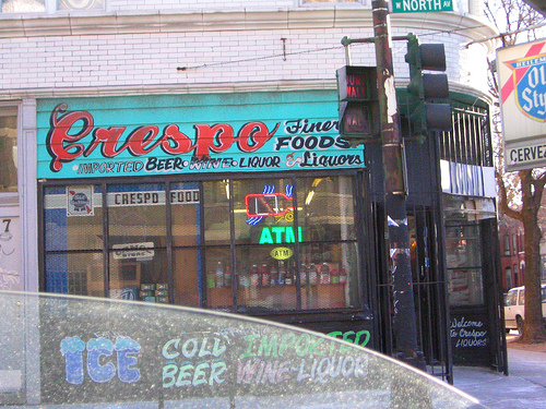
“Finer” foods is a nice touch.
Red and blue, handpainted sign

Red and blue, graffiti

i wonder if the heart symbol is a joke. i’m also having a lot of cognitive dissonance concerning those substitute/symbolic Os and the idea that letters are things, not pictures of things, while words are not things, but pictures of things. this leaves the graffiti approximately nowhere, but i still like the colours.
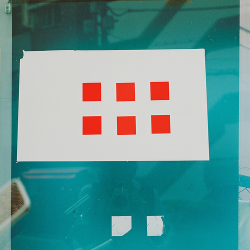
Red and blue, grids
Red and blue, glass and shoes

When I wore mary janes a lot, I used to be into the toes turned in thing. This photo is suddenly making me uncomfortable about it, presented like that with no irony at all regarding women in fancy shoes standing like little girls. I’m hoping my general hairiness was enough to contrast and balance the baby toes.
I had never related the toes to the shoes until last week. I noticed that when I wear my boots I tend to stand like Captain America, feet planted especially wide. Design affordance, I guess. Superhero boots afford superhero stances.