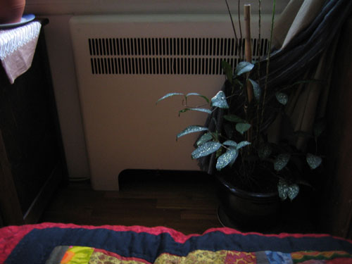
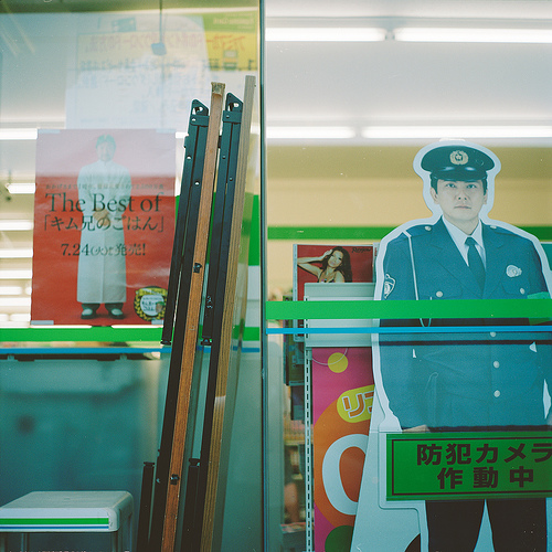
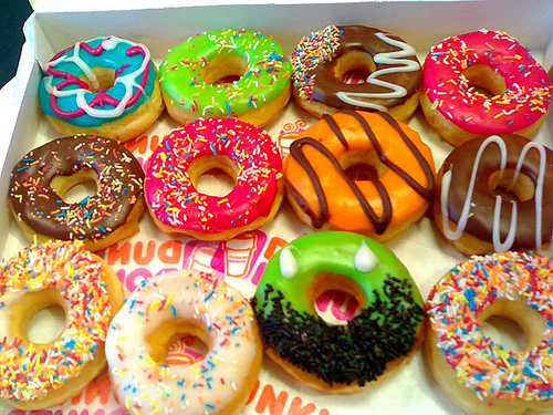
I noticed, while making the backgrounds for this website, that although I am very partial to red-and-blue, it feels even more satisfying to see red and blue and green. Then I became suspicious that I’m just addicted to RGB screens.
Month: December 2007
Red and blue, gate
About this new design
I feel like a bit of a wanker talking about My New Website Design since the point for me is to be self-explanatory (I already talked about this stuff by posting the design). But I do like talking about design in regular words too, so here goes.
- The monster’s name is Pearl. That takes some pressure off.
- Mouthful of words.
- Guts out.
- Memento mori in general, and in specific.
- These colours make me want to work.
- The monster is modelled after the radiator that faces our toilet.

- There are more hiding throughout the apartment.

- I thought a lot about Dark Daughta’s confrontational visual design, and mainly I came up with this badly drawn, blurry, lo-fi business. Trying to draw makes me happy. Goofy pixellation makes me happy. Siding with purposeful low quality makes me happy.
- This is about the best drawing I can currently do, which is embarrassing for somebody who makes a living doing design. Working on it. Bad drawing does no harm to mother earth.
- The title font is AUdimat by The Smeltery. I like the f.
Rug center, zig zags
Goth orca
Goth orca and a grainy orca family. I think I like these. It is hard to tell, after the years of local orca art overload.


