Toothcase

I went to the Surgeon’s Hall in Edinburgh, which is the original home of the Royal College of Surgeons. These days it contains three creepy museums on the history of surgery, pathology, and dentistry. It gave me lots of ideas relating to my indie thesis, but more on that later.

Rubber tooth forms, from the Museum of Dentistry in Edinburgh

Right now, teeth! The Museum of Dentistry was all about collections of things. Sets of antique drill bits, sets of ornate knives, sets of tooth brushes, sets of teeth. I’ve always liked collections of many objects that are similar but not exactly the same.

I remember at the Mendel Museum of Genetics in the Czech Republic, they had all these framed collections showing different phenotypes— 64 similar leaves arranged in a matrix, 25 drawings of similar feathers, 4 types of pea plants in square garden plots. I almost had a seizure, from glee.
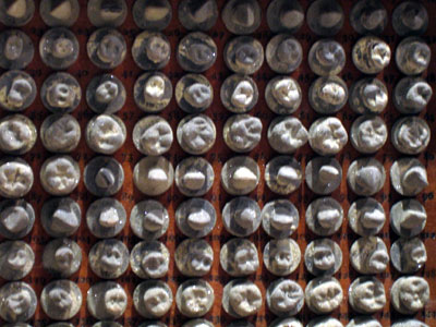
Rubber tooth forms, from the Museum of Dentistry in Edinburgh

I don’t know exactly why I enjoy similar sets so much, but I suspect you’ll just know what I mean. Similar-but-not-the-same objects are so common in nature, and so commonly considered beautiful, that there are whole design books on the topic. (My favourite discussion is in Christopher Alexander’s The Timeless Way of Building. Repetition with variation was a big part of his rationale for pattern languages.)
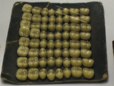
A set of teeth, from the Museum of Dentistry in Edinburgh

So these dentistry sets would have made my day no matter what, but the teeth were off the scale. I had never thought about it, but a mouthful of teeth is a similar-but-not-the-same set to start with, and then setting up grids of multiple mouthfuls in different sizes… my mind reels.
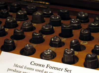
Crown former set, from the Museum of Dentistry in Edinburgh

Furthermore, some of these tooth sets— which were blanks meant for casting false teeth— were arranged in cases. They were a lot like type cases— if I had a tooth case I would definitely keep the top teeth in the upper case and the bottom teeth in the lower case, like letters in a printing font. Thinking about uppercase and lowercase teeth has multiplied my affection for my mouth, because now it is not just a mouth but a printing press for bite marks.
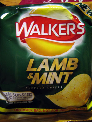
Snacks: a last holdout against globalization

I just spent two weeks in Scotland and England with my mum. It was lots of fun, but I was a little disappointed in how similar everything was to home.

When I was in Europe in 2003, the fashion was so far ahead I could only point and laugh, and there were always some obvious local specialties. In Holland, every pub had Heineken and Grolsch on tap, as you’d expect. Bars in Granada served free tapas with every drink; bars in Barcelona didn’t.

On this trip, we had to hunt and hunt to find anything we couldn’t get in Vancouver. There were more people dressed fashionably, but the frontiers of fashion were set in approximately the same places as they are here.

I made my mum take a highway exit twice so that I could get another fleeting glimpse of some highland cattle, because they were so hard to find. Despite spotting millions of sheep in the countryside, we were hard pressed to find any non-tourist shops selling local woolens. Do Scottish people ignore their huge wool harvest, or do they just wear the dumb tourist sweaters? It was frustrating.

Right after my mum and I had been sort of lamenting that globalization had made travel more boring, we stopped to buy some snacks for the trip to the next place. I remembered all the weird chips and candy I’d hoarded in Eastern Europe, and made a trip down the “crisps and biscuits” aisle.

Gold!

Walker's Lamb and Mint Flavour Crisps

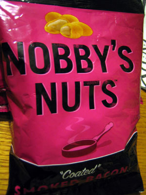
Nobby's Nuts

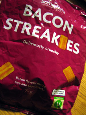
The green V logo in the corner of the next one means “suitable for vegetarians.”

Bacon Streakies

Besides the snack differences, the UK might be the world headquarters for design that uses an object to replace a letter in its own name. Every mention of Italy used the boot for the L; every fish shop’s name was spelled with a fish… every package of bacon streakies had a little bacon streaky for an I. So there’s that.

Lies, all lies

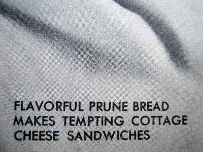
Flavorful prune bread makes tempting cottage cheese sandwiches

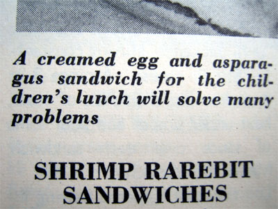
A creamed egg and asparagus sandwich for the children's lunch will solve many problems

The biggest lie of all is right in the title, of course.

500 Tasty Sandwiches

I’m going to lobby Galen to include the bit about “Fancy breads, fillings and spreads…” in a Panty Boy song. So poetic, and rich with innuendo. Fillings and spreads is my new code name for pornography.

They are obviously trying to kill me

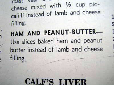
Ham and peanut-butter sandwich recipe

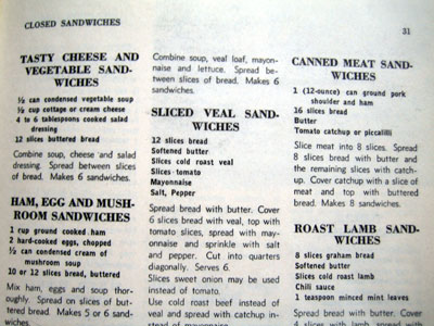
Several recipes

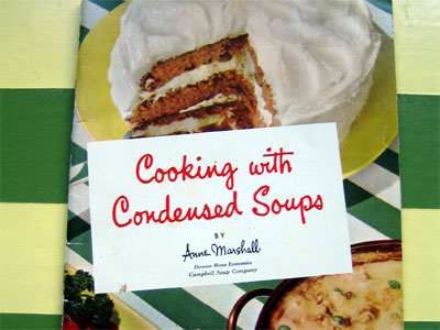
I don’t know if you can process the solid block of horror in that last photo, but be sure to note that any mentions of vegetables are actually referring to condensed soup. (See also:)

Cover of 'Cooking with Condensed Soups'

(Yes, that’s a cake.)

One true thing, so you don’t die

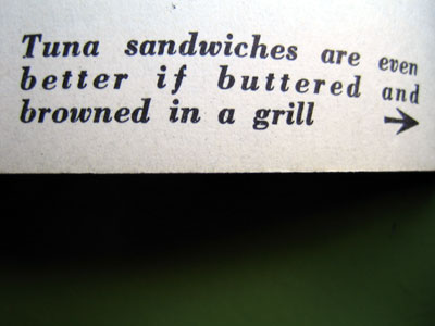
Tuna sandwiches are even better if buttered and browned in a grill

I would follow that little arrow pretty much anywhere, so it’s good that it’s playing for the one tasty sandwich I can get behind.

I can’t keep these sort of objects in the house— I end up thinking too hard about how kitsch is gross even if it contains rad typography— but I send them to my friends.

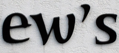
The A that makes me crazy

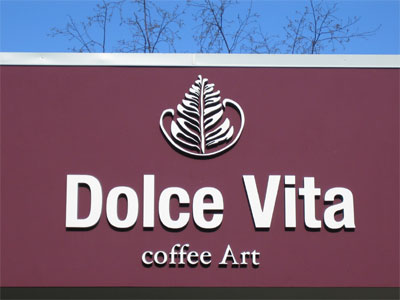
A sign: Dolce Vita, coffee Art

The strange capitalization puts a lot of emphasis on that capital letter A, and the A is backwards. It’s across a parking lot from a really nice, gigantic, properly-oriented capital A, so you’d think whoever put up that sign would know better. I’m open to the possibility that this was an intentional, very subtle message about the nature of coffee Art, but that makes me even less inclined to go inside.

Almost the same

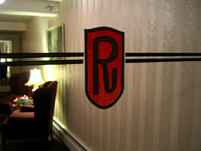
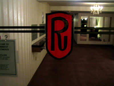
Rockridge apartments logo

Rockridge apartments logo

There are a lot of handpainted apartment doors in my neighbourhood. I should take better pictures of them.

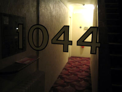
1044 doorsign

Two Rs that almost match, two 4s that almost match. Repetition with variation might be the Christopher Alexander design thought that I remember most often. I’ve always been into collections of similar objects, and think the slight variations are the root of my fascination. Add them all together and you can see the spectral range of a Rockridge R, or of 1044’s 4s. They put each other in context. I’ve never thought of handwriting as a collection of similar-but-not-quite-the-same objects, but indeed it is.